Dream home as a gathering place for family and friends
 With so few buildable lots remaining in our corner of Philadelphia, it’s refreshing to have the opportunity to design a new house on a beautiful lot in Haddonfield, New Jersey. This is the story of what happens when we add to that clients with a clear vision of what they want in terms of architectural style, and their perfect alignment with our design aesthetic. The clients, who are expecting their second child, selected the 3 ½ acre property for its location. Close to family and backing onto a golf course, it’s the ideal spot for them. The problem was, it came with a 1960s ranch house that would not work with their plan for a dream home as a gathering place for family and friends.
The dream home concept
Though the ranch house is being demolished, the home that will replace it will provide enjoyment for the large, extended family for many years to come. Our clients came to us specifying only the number of bedrooms and that the focus should be on outdoor play. From that start, we developed the program together.
This home is truly designed around the outdoors. What’s more, it embodies a couple of decades of design and practice experience on my part.
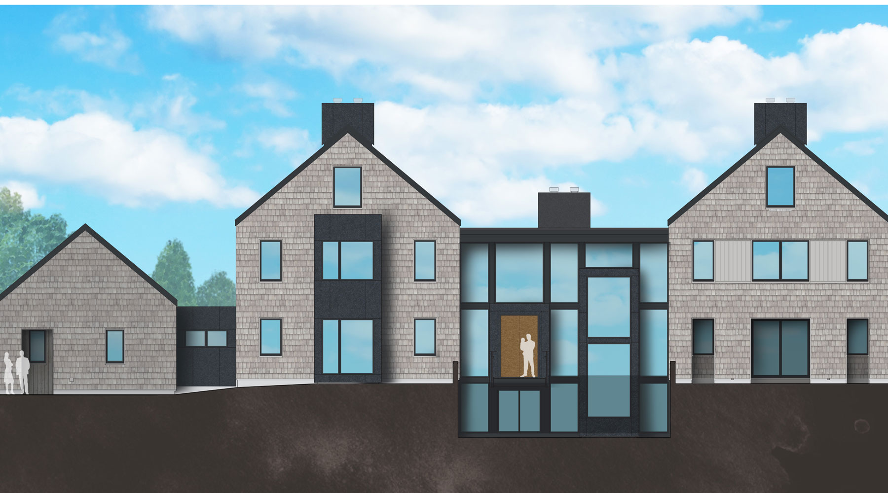
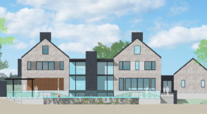
First, it’s a fairly large house, so we’ve broken the mass of the house down into a series of individual volumes to reduce the apparent size and scale. So it’s like a little village; a collection of small houses, rather than one large mansion.
The forms are very simple, like a child’s drawing of a house: two stories, a gable roof, chimney, and a couple of windows. It’s this very simplicity that delights us. The intention was to break the massing down while also making it easy to build and minimizing construction costs. There aren’t unnecessary embellishments or flourishes. As a result, the simplicity of the house creates a repose, a restfulness.

How it works
The basic design features two gabled pavilions connected in the center by a large, double height space that contains the family room on the first floor and another play space in the basement. The floor plan is set up so the master suite occupies one of the pavilions and the kids’ bedrooms the other. A bridge connects the two pavilions under a flat roof center section.
Beneath the kids’ bedrooms is the kitchen and dining room; beneath the master bedroom suite is a guest bedroom for the clients’ parents and an outdoor dining room, with steps leading down to the pool area. The middle piece on the first floor is a large family room, the hub of the house where all the entertaining occurs. These areas and the sport court will really make this home a gathering place for extended family and friends.
There is balance to the design, yet a tension between the two gable forms because they aren’t entirely symmetrical. Instead, the rooms inside vary and we express that on the exterior elevations through the size and placement of the windows. The house is both familiar in appearance and yet, compositionally, causes the eye to move about. The elevations display a dynamic quality. That’s the mark of a successful painting, graphic design, and architectural composition. Our eye prefers not just a central focal point, but competing focal points.
To link the pavilions, we introduced flat roof sections that are discreet rooms and give the house a much more contemporary appearance. (If it had a pitched roof, it would become larger in massing and more traditional in form.) While this is a contemporary house, the gables are what many people relate to as a home and the flat roof section serves to emphasize them.
Indoor-outdoor connection
The other major feature of the massing is that we’ve created a courtyard with multiple buildings to make the outdoor spaces contained and private. We’ve extended the indoors out and vice versa with the outdoor dining room. Nearby is the open air pavilion, part of the pool area; the garage is on the opposite side. Throughout it all, there’s a clear interaction between the interior spaces and the exterior, with the views and the flow of activity between them.
Another key feature is that the back of the house faces essentially south; we’re very aware of taking advantage of that in the winter with passive solar gain, while at the same time shading the south-facing glazing in the summertime; for this, we have screen walls and louvers. Though there is lots of glass in the rear wall of the building – for example, opening onto the balcony on the second floor to maximize views of the pool and golf course – much of the glass is protected with overhangs and shading. So once again expressing tension and balance, the front and back of the home is altered as needed to reflect the solar orientation. Our willing, receptive and excited clients call this their dream home for the gathering of family and friends. The fact that the design distills and embodies much of what I’ve learned in the course of my architectural career makes it in some senses my dream home, too.
–JK